Late last summer, I sold the 1850 brick Italianate row house I had renovated over the last five years and purchased a massive 1910 late Victorian home. My “new” home has been well cared for over the years. The original windows are still intact throughout (and were re-roped at some point in the last five years or so). The beautiful woodwork has been meticulously maintained, from the mahogany front stairs and mantles to the wide pine planks throughout the second floor/living quarters. The high-quality materials and craftsmanship that went into building this home remain as impressive today as they were nearly 110 years ago. The beautiful eight-foot tall stained glass window in the formal front stairwell makes for an impressive entryway, the built-in china cabinet a functional feature piece, and the enormous butlers pantry (with its own built-in cabinets) is the envy of many modern homes. I love nearly every inch of this home.
Except for the kitchen. I knew when I bought the house that I would want to change this space. Last updated in the mid-1990s, the kitchen had a country look that simply did not fit the house (and certainly does not fit the current owner). It was updated as part of an addition that created a modern master suite, a full first-floor bathroom, a laundry room, and a family room off the kitchen. The added space was great. The execution was less stellar.

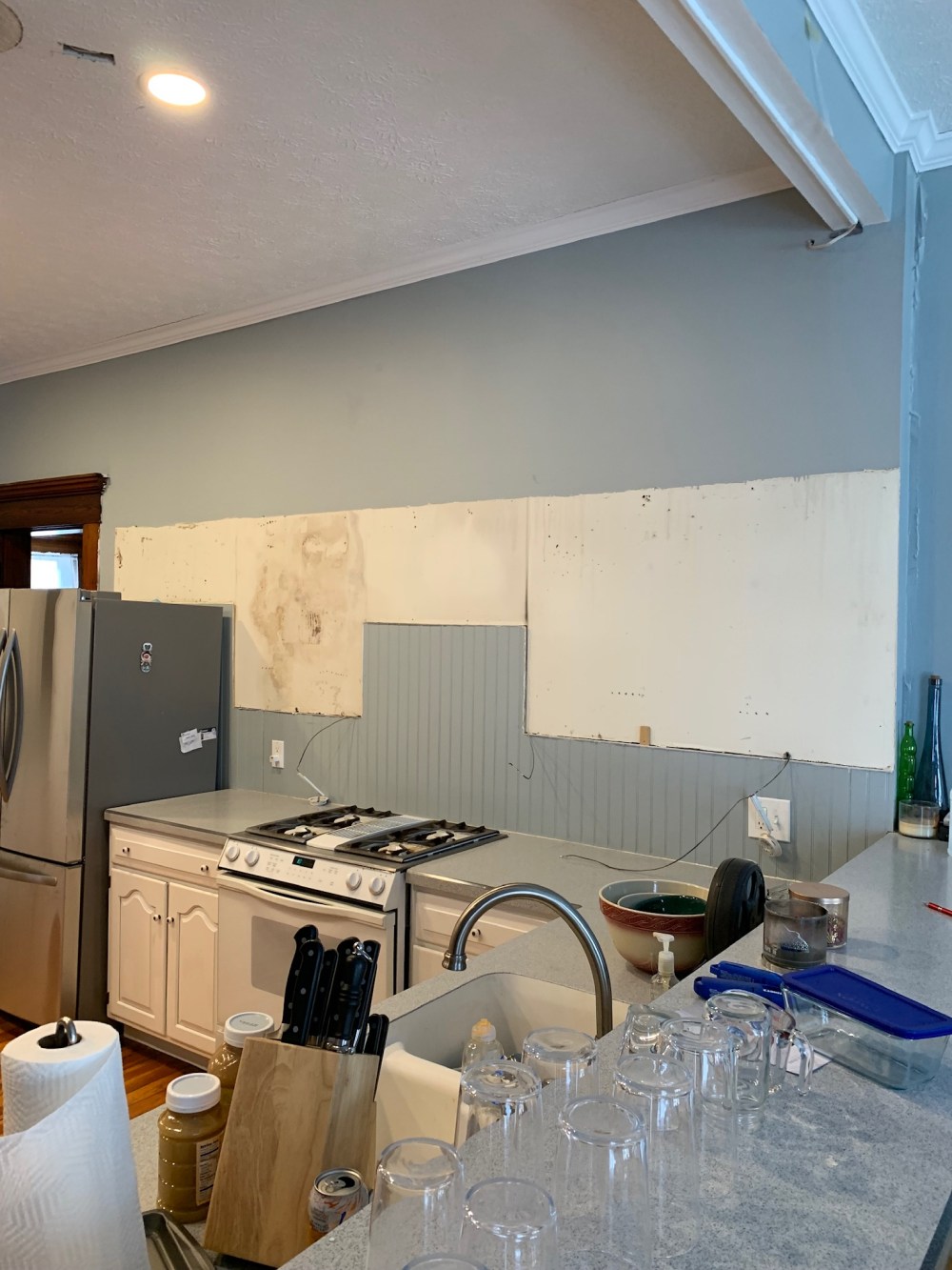
There was beadboard everywhere– why is there a beadboard backsplash?? A trash compactor but no place for a trash can? Is this what passes for functional design in 1994? Is the pendant for a pool table at grandma’s house?

What is the purpose of this coffee bar? It is too low to be functional. It seemed to exist to annoy me into not wanting to make coffee. Was this undersized island inspired by your love of bowling alleys? Great idea to wrap it in more beadboard. The space really needed something extra. Bonus points for the fan hanging down extra far and having two builders grade “boob” lights for illumination.
I knew from my last kitchen remodel how time-consuming and laborious the process could be so I decided I’d look into hiring out most of the work this time. I had seven different companies submit bids based on my design and didn’t like any of them. I thought about putting off the project until I got more time to do things myself until friends of mine in Delaware showed me the work they had done on their kitchen and gave me their contractor’s contact info. I reached out to Mark Casino at Casino Co. Renovations and set up some time to talk. He and his carpenter, Derek Brown, listened to my plan, offered suggestions, and took the time to really look over the rest of my house. They put together a competitive bid, had a much stronger portfolio, word of mouth from my friends, and impressed me with their demeanour and knowledge during our meeting. Having settled on my design and my contractor (this took from October 2018 to January 2019) we were ready to begin.

The lights and fan went first. Not only were they ugly energy hogs, they put off awful light. In went six LED recessed lights on a dimmer switch. Now it lights the space up at a fraction of the cost.
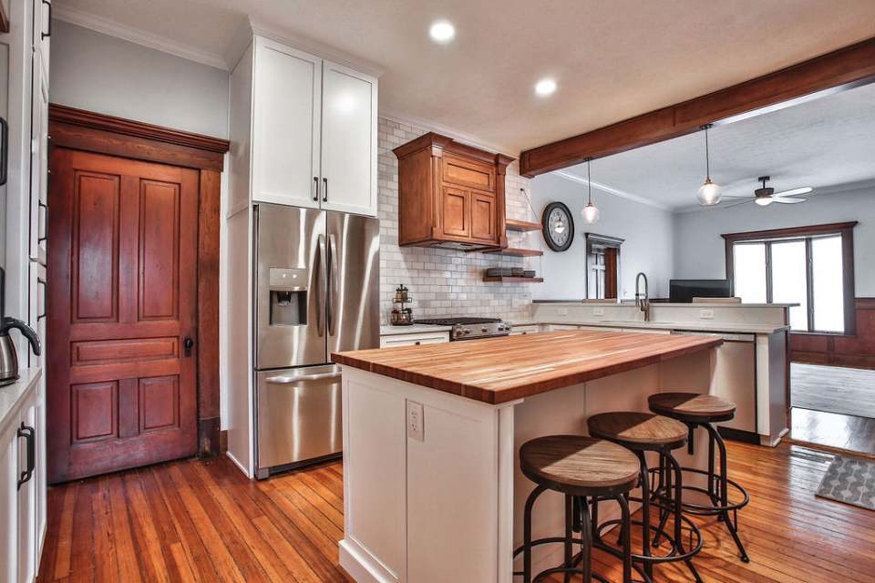
I decided that between the additional space in the island, coffee bar/pantry, and the existence of the butler’s pantry we could sacrifice upper cabinets in order to facilitate a more aesthetically pleasing, open design. So out they came. This was probably the design point I got the most pushback on when I’d talk about my plans with people.
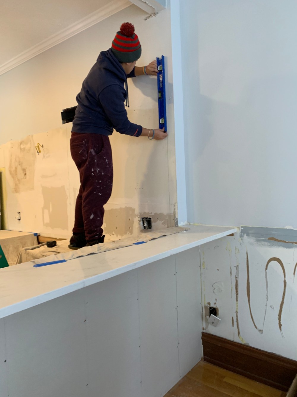
Instead, I wanted a wall of marble tile. I settled on a classic brick stack of Carrera marble, leaving in random tiles with rust spots and other imperfections to add some diversity to what I worried might be a very sterile looking wall. Instead of using an edging tile or metal edging trim, I decided to use the same tile vertically to define the space.
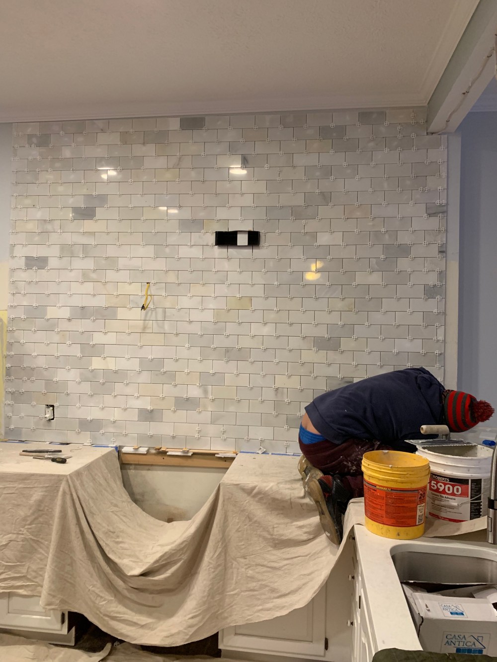
If you can see beyond the tiler’s crack, I’d have to say it came out pretty well. The custom range hood and floating shelves (reinforced with heavy wire) gave the space back some functionality without losing the aesthetic of the tile wall.

All finished photos of the project are courtesy of Sarah Shambaugh.

The bowling lane and inappropriate upper in the coffee bar were next to go.

There was plenty of room on all sides to expand the island. So I did. Instead of cabinets I asked for a trash drawer, two pot drawers, and a utility draw of sorts all disguised as regular doors. I still loved the pulls and knobs I used at N Union, so I decided to buy more of them but flip to pulls on doors and knobs on drawers. I worried that the white quartz countertop I was going with along with the white cabinets was going to create a whitewash of sorts so I talked with my carpenter Derek about possible solutions. Since we had decided to do a custom cherry range hood and open shelves he suggested building a custom cherry butcher block to go along with it.
The coffee bar was actually the first thing I came up with a redesign for. Take out that stupid upper and bring the tile all the way to the ceiling. Maybe do a fun tile or pattern in the space. How about the same marble tile in a herringbone pattern? That’s it! Take the side pantry cabinets all the way up and top with some crown moulding. A couple of open shelves across and you are finished. Put side panels on the refrigerator and put a huge cabinet to the ceiling over it.
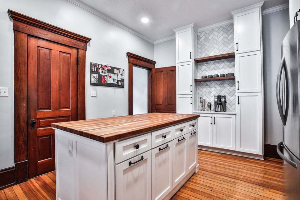


I think it works.
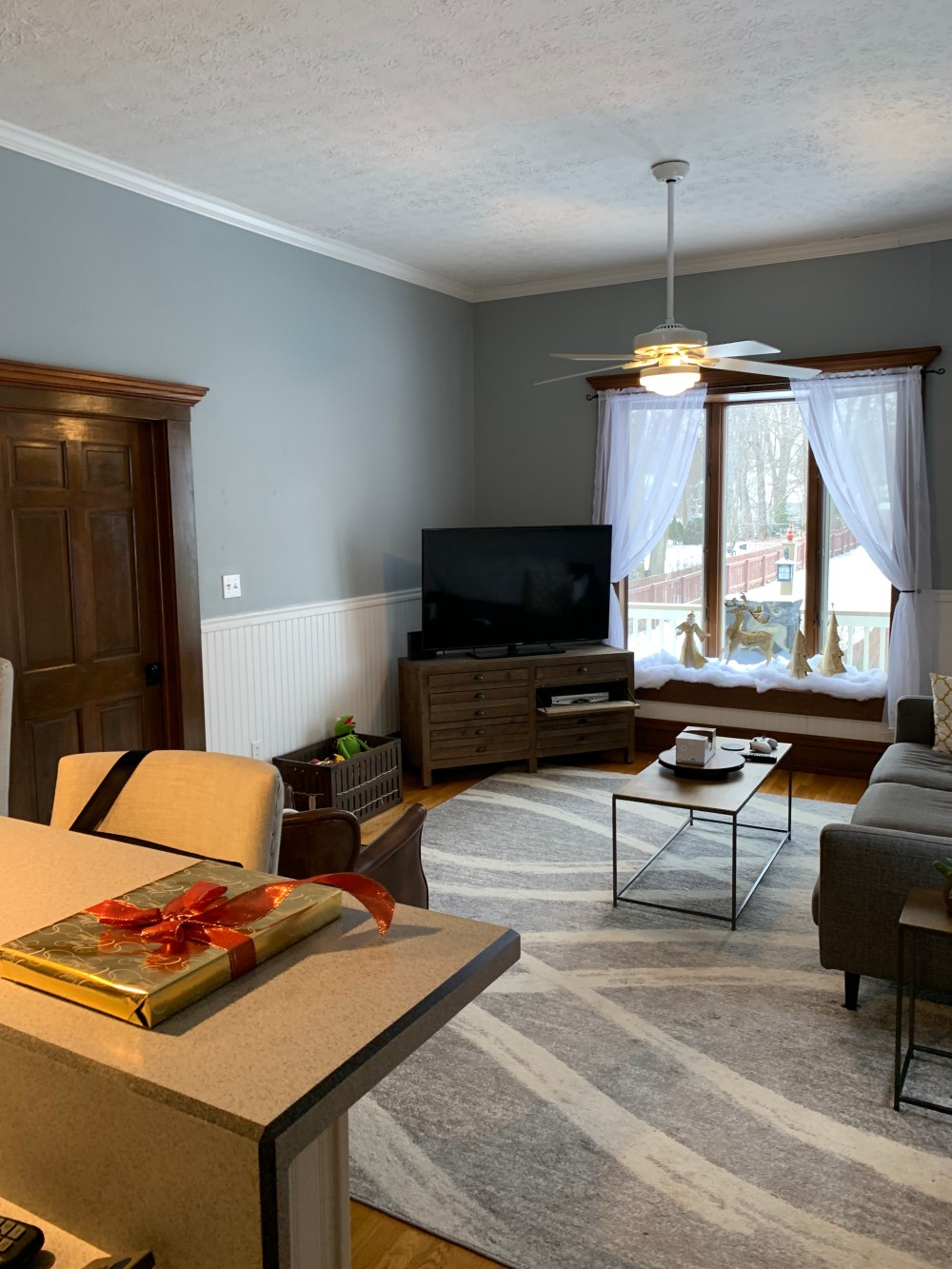
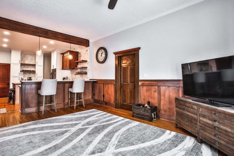
I couldn’t just update the kitchen and leave the beadboard explosion in the family room. Playing off the cherry updates in the kitchen, Derek was sure he could create some wainscoting panels and a beam over the peninsula that would pull in those elements while also working off the original trim and woodworking throughout the rest of the house. I decided that the fan had to go to, replaced by a more modern oil-rubbed bronze one that would match my hardware and pendants. Putting in modern blinds and a more subtle blue paint job finished the look.
One day the grey leather couch I ordered in February might even come in!
I feel great about how the project turned out. The kitchen and family room went from the worst part of my house to one of the better features. It fits much better with the rest of the house, replacing generic 90s country design from your local big box store with custom craftsmanship tailored to my home and tastes. Everyone on Mark’s team was amazing to work with (and I cannot say enough about how impressive Derek’s work was– both in his work and his willingness to bat ideas around with me). Not only were they very professional (always leaving the site cleaner than they found it, responding promptly to any issues or wants I had) but they were incredibly friendly and helpful. They would patiently walk me through how they were doing something, satisfying my curiosity and enriching my understanding of the process. If you are thinking about doing a major remodelling project in the Columbus area and want creative, custom solutions I would highly recommend them.
